Shopify theme documentationDocumentación del tema Shopify

Verity documentationDocumentación de Verity

One theme, five industry presets. Everything here applies to Verity 1.0.0 and later.Un tema, cinco presets sectoriales. Todo lo aquí descrito se aplica a Verity 1.0.0 y posteriores.

IntroductionIntroducción

Verity is one theme with five industry systems inside it. A preset changes the product card architecture, the catalogue rhythm, the header composition and the way product data is presented — not only the colours.Verity es un tema con cinco sistemas sectoriales dentro. Un preset cambia la arquitectura de la ficha de producto, el ritmo del catálogo, la composición de la cabecera y la forma de presentar los datos, no solo los colores.

It is built for shops whose product needs explaining: a concentration, a measured figure, a material, an origin, a dose.Está pensado para tiendas cuyo producto necesita explicación: una concentración, una cifra medida, un material, un origen, una dosis.

InstallationInstalación

  1. In your Shopify admin open Online Store → Themes.En el panel de Shopify abre Tienda online → Temas.
  2. Add Verity from the Theme Store, or upload the ZIP under Add theme → Upload zip file.Añade Verity desde la Theme Store, o sube el ZIP en Añadir tema → Subir archivo zip.
  3. Open Customize and choose a preset under Theme settings → Theme styles.Abre Personalizar y elige un preset en Configuración del tema → Estilos.
  4. Publish when you are ready.Publica cuando estés listo.

Installing the theme does not change your products, collections, pages or navigation. Verity uses no apps and loads no external scripts.Instalar el tema no modifica tus productos, colecciones, páginas ni navegación. Verity no usa aplicaciones ni carga scripts externos.

The five presetsLos cinco presets

PresetPresetBuilt forPensado paraCard architectureArquitectura de ficha
VerityVerityClinical skincare and formulatorsCosmética clínica y formuladoresclinic — the product printed whole on a tinted plateclinic — el producto completo sobre una placa tintada
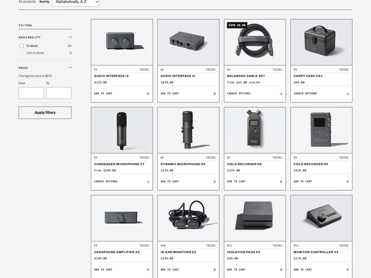
GraphiteGraphiteTechnical equipment and instrumentsEquipos técnicos e instrumentosspec — landscape plate, monospace index, full-width controlspec — placa apaisada, índice monoespaciado, control a todo el ancho
ClaretClaretPerfume, apothecary, small-batch makersPerfumería, botica y producción artesanalapothecary — warm photograph over a centred captionapothecary — fotografía cálida sobre un pie centrado
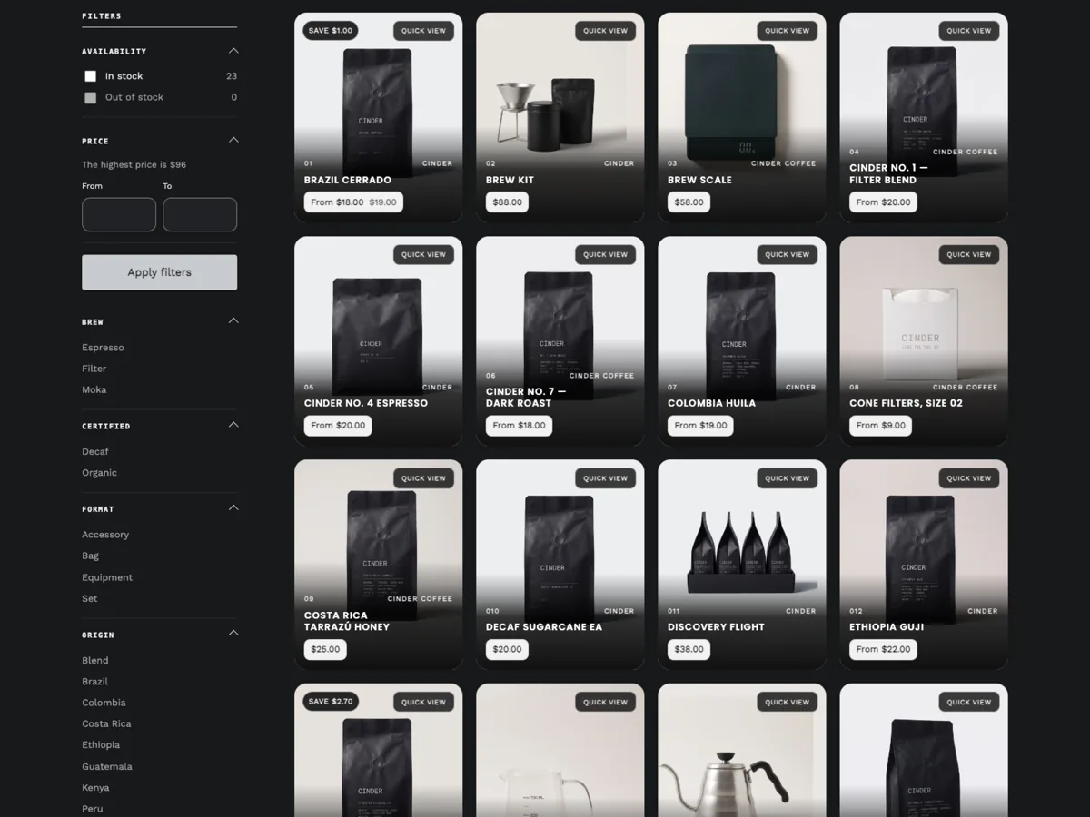
BasaltBasaltCoffee and origin-led cataloguesCafé y catálogos por origenoverlay — caption over the photograph under a gradientoverlay — pie sobre la fotografía bajo un degradado
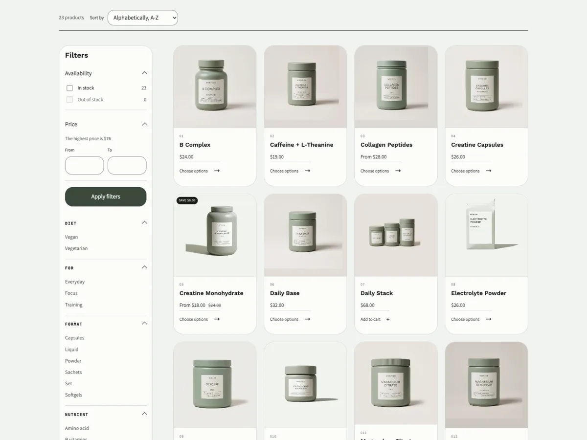
SageSageSupplements and functional nutritionSuplementos y nutrición funcionaldossier — square plate over a labelled caption blockdossier — placa cuadrada sobre un bloque de datos etiquetados

Switch preset at any time in Theme settings → Theme styles. Your content is untouched; only the presentation changes.Cambia de preset cuando quieras en Configuración del tema → Estilos. Tu contenido no se toca; solo cambia la presentación.

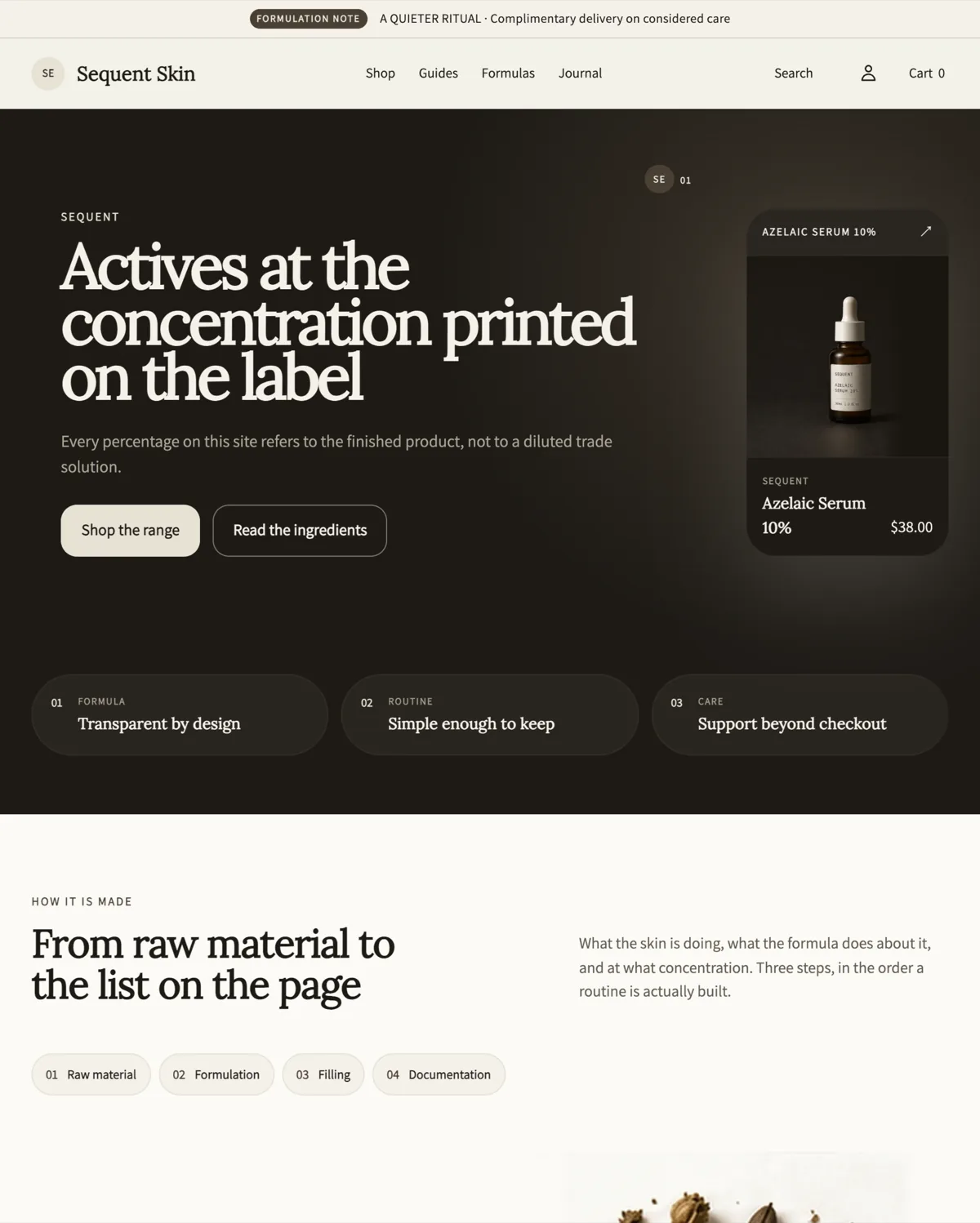
Sequent Skin home page in the Verity preset: a dark editorial hero reading
Verity — clinical skincareVerity — cosmética clínica
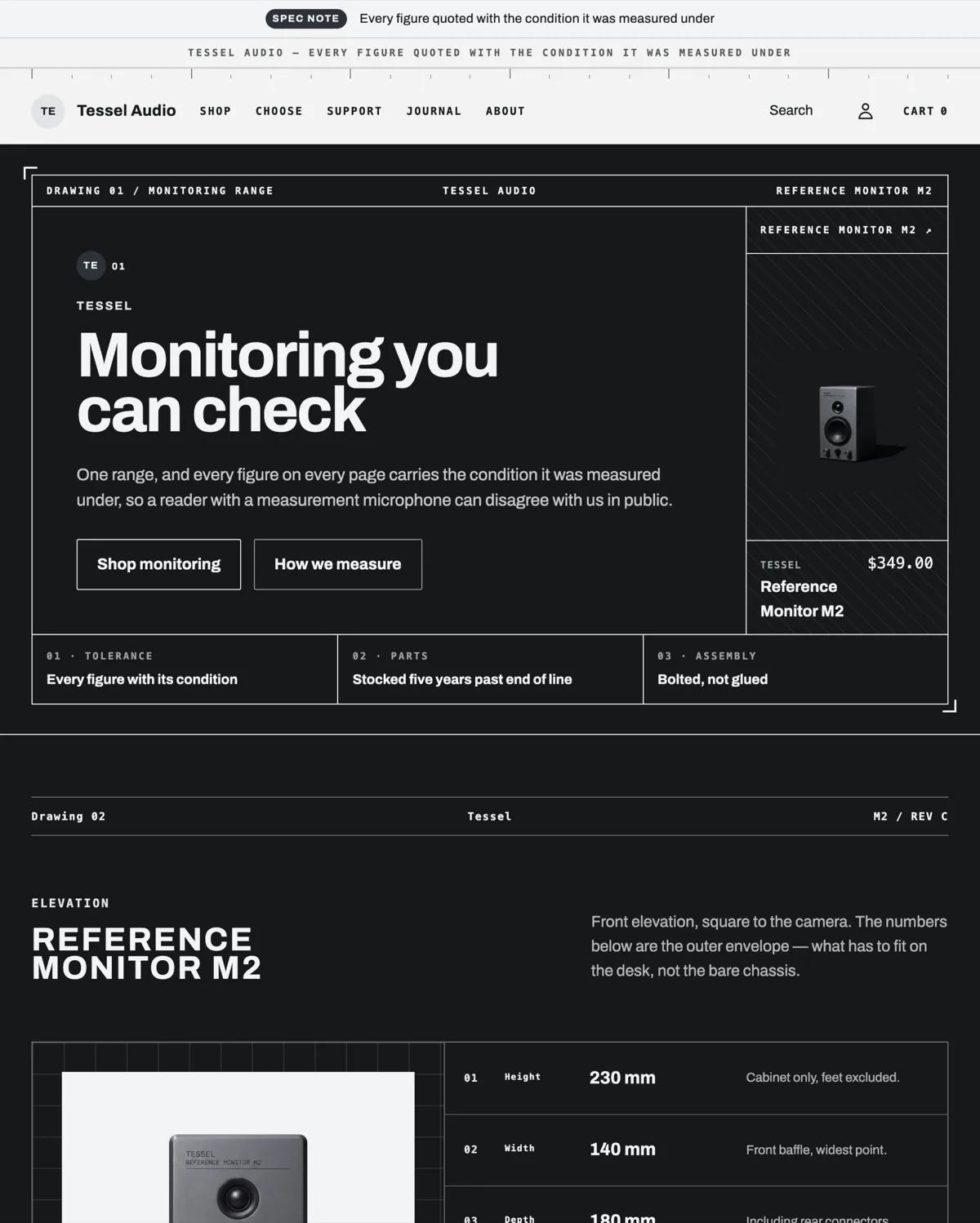
Tessel Audio home page in the Graphite preset: a drawing sheet frame around the hero, the title block reading DRAWING 01 / MONITORING RANGE, and a studio monitor on the right
Graphite — specification-ledGraphite — orientado a especificaciones
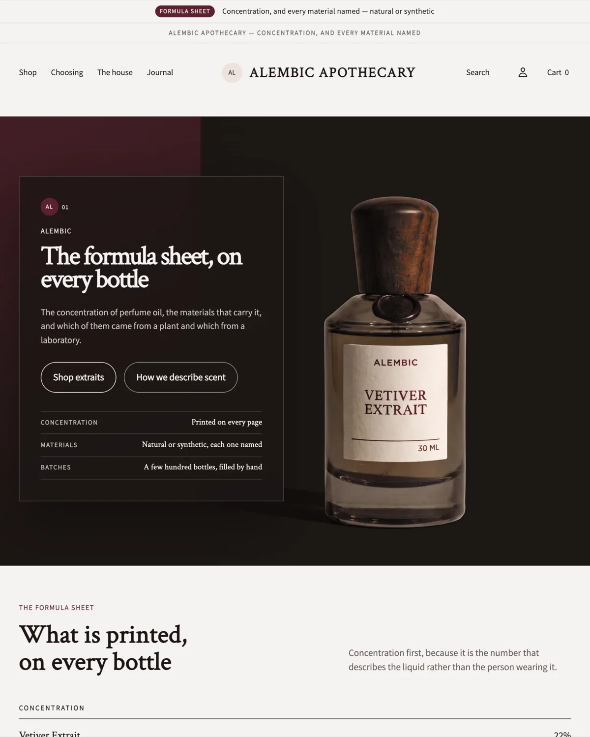
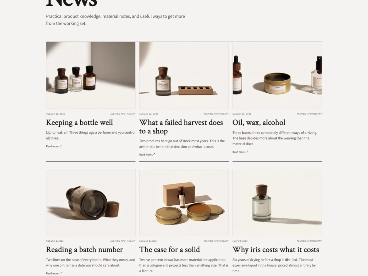
Alembic Apothecary home page in the Claret preset: a centred wordmark, warm editorial hero and a perfume bottle photographed against a blush ground
Claret — apothecaryClaret — botica
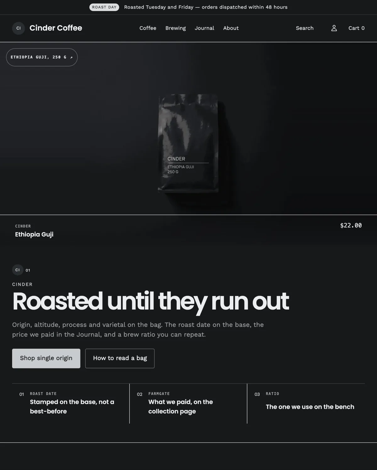
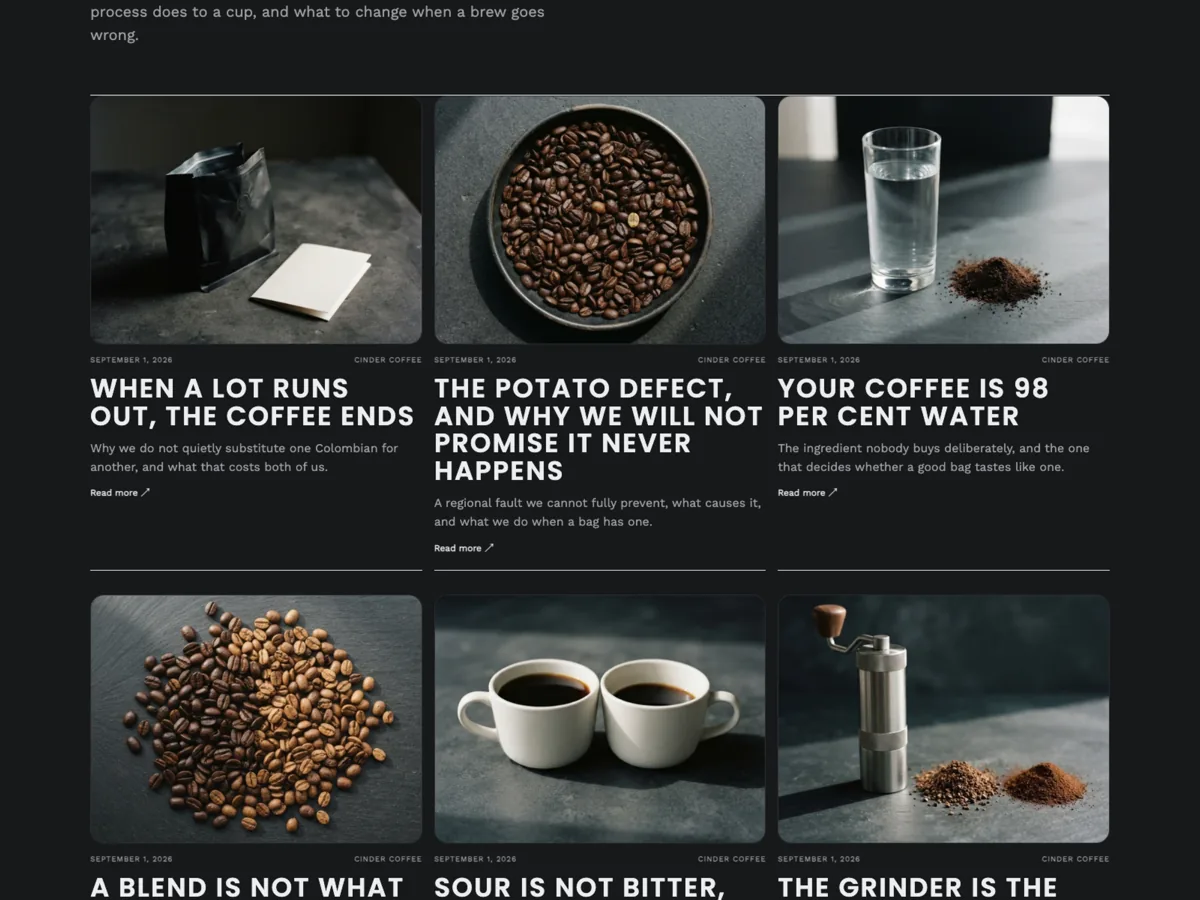
Cinder Coffee home page in the Basalt preset: a near black storefront with a photographic hero and roast information
Basalt — coffeeBasalt — café
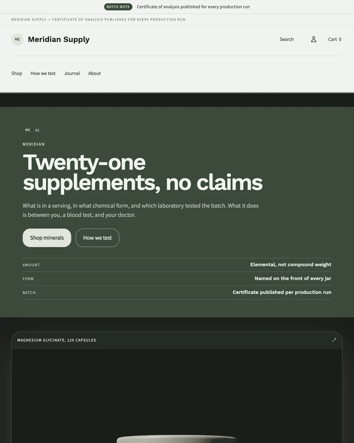
Meridian Supply home page in the Sage preset: a pale green storefront with a two row header, editorial hero and a supplement jar
Sage — supplementsSage — suplementos

Theme styles and global settingsEstilos y ajustes globales

  • Colours — five colour schemes per preset, chosen per section.Colores — cinco esquemas por preset, elegidos por sección.
  • Typography — heading and body faces, set per preset.Tipografía — familias de titular y texto, definidas por preset.
  • Buttons — solid or outline.Botones — sólidos o de contorno.
  • Commerce mode — the merchandising rhythm of the home page and collection headers.Modo de comercio — el ritmo de la portada y de las cabeceras de colección.
  • Product cards — architecture, image ratio, second image on hover, vendor line, quick view, quick add.Fichas de producto — arquitectura, proporción de imagen, segunda imagen al pasar el cursor, línea de marca, vista rápida y compra rápida.
  • Badges — the new and bestseller tags and how many days count as new.Distintivos — etiquetas de novedad y más vendido, y cuántos días cuentan como novedad.
  • Favicon — a square image, 512×512 or larger.Favicon — imagen cuadrada, 512×512 o mayor.
Meridian Supply home page in the Sage preset: a pale green storefront with a two row header, editorial hero and a supplement jar
A pale scheme, set in Theme stylesUn esquema pálido, definido en Estilos del tema

Announcement barBarra de anuncios

Part of the header group. It takes a short label and a message and can be linked. Keep it to one line on a phone: long messages wrap and push the header down.Forma parte del grupo de cabecera. Admite una etiqueta corta y un mensaje, y puede enlazarse. Mantenlo en una línea en móvil: los mensajes largos se parten y desplazan la cabecera.

Product cardsFichas de producto

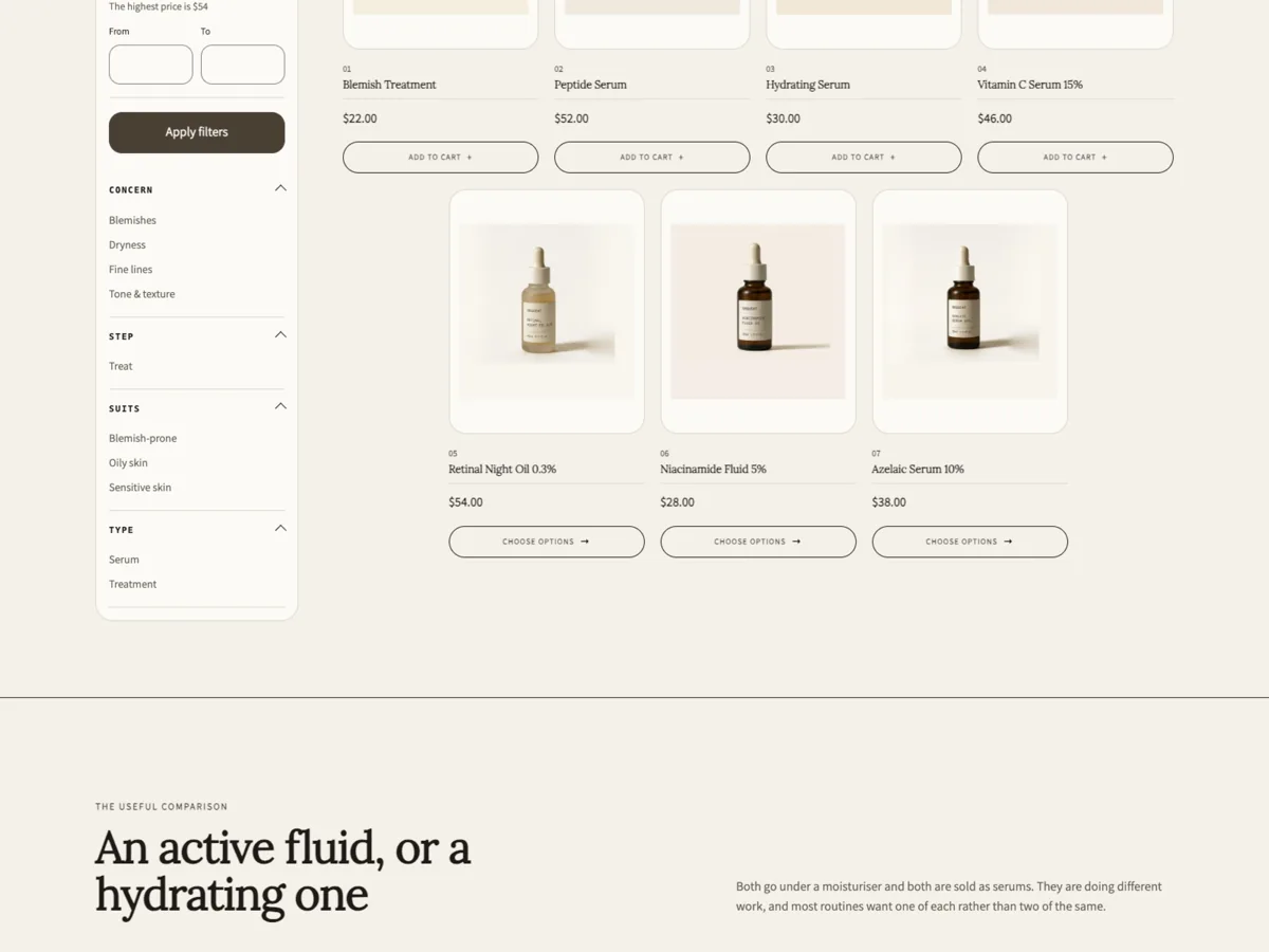
Theme settings → Product cards → Card layout selects one of five architectures. The grid around them is shared: four across at 1200 pixels and wider, two between 750 and 1199, two below 750. A short final row is centred, and an odd last card keeps its normal width.Configuración del tema → Fichas de producto → Diseño de ficha elige una de las cinco arquitecturas. La retícula es común: cuatro por fila a partir de 1200 píxeles, dos entre 750 y 1199, y dos por debajo de 750. Una última fila incompleta se centra y una ficha impar conserva su ancho.

Other card settings: image ratio, second image on hover, and the vendor line.Otros ajustes: proporción de imagen, segunda imagen al pasar el cursor y línea de marca.

Serums collection in the Verity preset: four clinic cards across, each product photographed whole on a tinted plate above a hairline, price and an outlined add to cart control
clinic — contained plate, outlined controlclinic — placa contenida, control de contorno
Tessel Audio catalogue in the Graphite preset: four specification cards across, each with a landscape product plate, monospace index and vendor, price and a full width uppercase control
spec — landscape plate, monospace indexspec — placa apaisada, índice monoespaciado
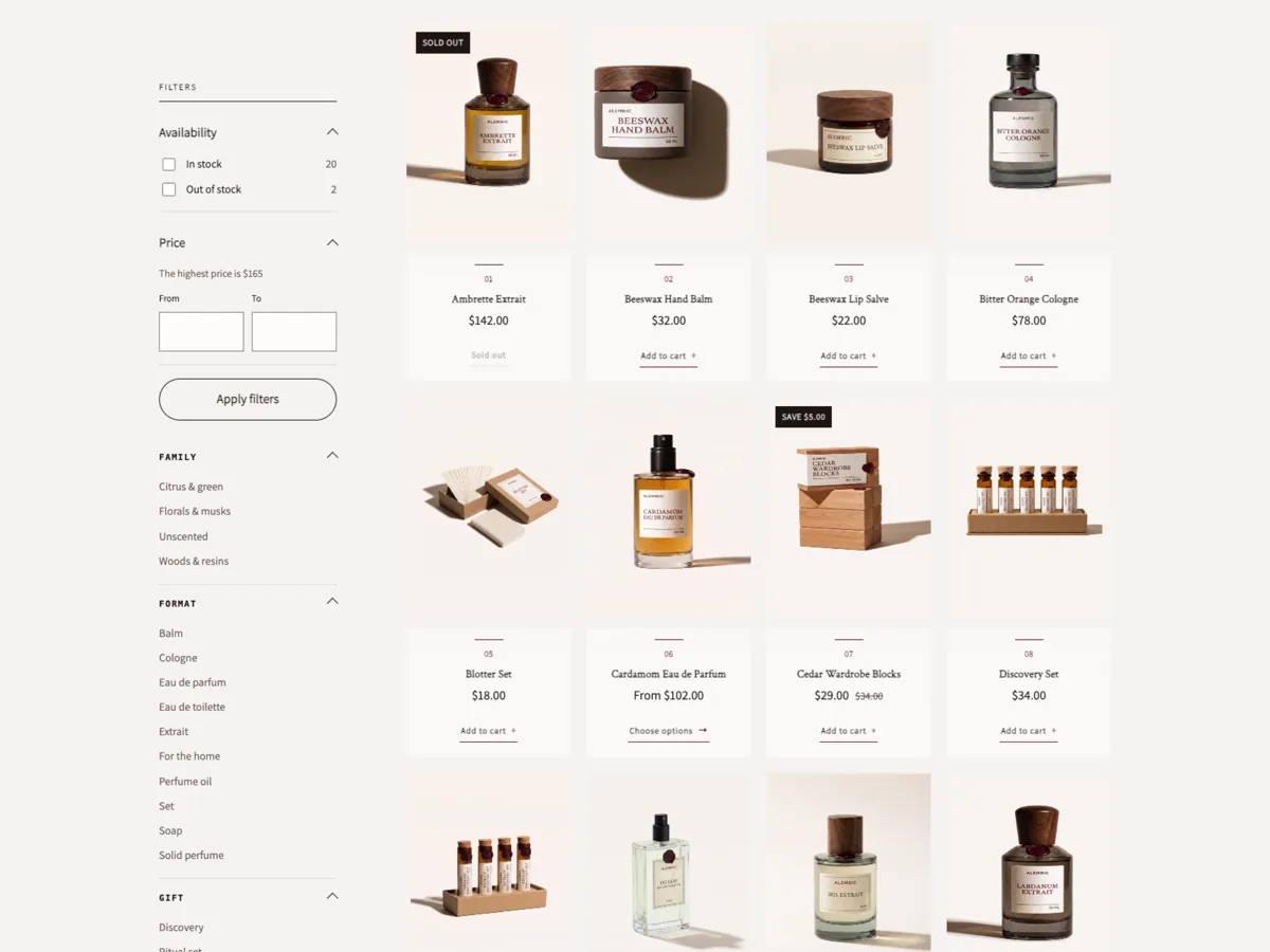
Alembic catalogue in the Claret preset: four apothecary cards across, tall warm photographs over centred captions parted by a short accent rule, each with a lettered add to cart line
apothecary — tall photograph, lettered actionapothecary — foto alta, acción escrita
Cinder Coffee catalogue in the Basalt preset: four photographic overlay cards across, each with a Quick view chip in the top corner and index, origin, name and price over the gradient
overlay — caption on the photographoverlay — pie sobre la fotografía
Meridian catalogue in the Sage preset: four dossier cards across, a square plate over a labelled caption block with the format and dose
dossier — square plate, labelled captiondossier — placa cuadrada, pie etiquetado

Quick view and quick addVista rápida y compra rápida

Each preset ships with exactly one action control per card, because two controls compete for the same corner.Cada preset incluye un único control de acción por ficha, porque dos controles compiten por la misma esquina.

  • Quick add adds a single-variant product to the cart from the card and links to the product page when the product has options.Compra rápida añade al carrito un producto de una sola variante y enlaza a la ficha cuando el producto tiene opciones.
  • Quick view opens the product in a dialog over the catalogue. The Basalt preset uses this and does not render the quick-add block at all.Vista rápida abre el producto en un diálogo sobre el catálogo. El preset Basalt la usa y no muestra el bloque de compra rápida.

Both are switched in Theme settings → Product cards. Enabling both puts two controls on one card and is not recommended.Ambas se activan en Configuración del tema → Fichas de producto. Activar las dos coloca dos controles en una ficha y no se recomienda.

Cinder Coffee catalogue in the Basalt preset: four photographic overlay cards across, each with a Quick view chip in the top corner and index, origin, name and price over the gradient
Quick view sits in the free top corner, opposite the badgesLa vista rápida ocupa la esquina libre, frente a los distintivos

Collection layoutsDiseños de colección

TemplatePlantillaProducts per pageProductos por páginaCollection imageImagen de colección
DefaultPredeterminada1212hiddenoculta
TechnicalTechnical2424hiddenoculta
EditorialEditorial88shownvisible

Assign one in Products → Collections → Theme template. You can add sections to any of them — specification rows, comparison tables, evidence blocks, FAQ — and fill them with your own content.Asigna una en Productos → Colecciones → Plantilla del tema. Puedes añadir secciones a cualquiera de ellas — filas de especificación, tablas comparativas, bloques de evidencia, preguntas frecuentes — y completarlas con tu contenido.

Serums collection in the Verity preset: four clinic cards across, each product photographed whole on a tinted plate above a hairline, price and an outlined add to cart control
Four across at 1200 pixels and widerCuatro por fila desde 1200 píxeles
Alembic catalogue in the Claret preset: four apothecary cards across, tall warm photographs over centred captions parted by a short accent rule, each with a lettered add to cart line
Collection image shown, eight products per pageImagen de colección visible, ocho productos por página

Filtering and sortingFiltros y ordenación

Both are switched on in the collection section settings. Filters come from Shopify Search & Discovery or from your storefront filter settings; the theme renders whatever you configure there, including availability, price and metafield filters.Ambos se activan en los ajustes de la sección de colección. Los filtros provienen de Shopify Search & Discovery o de la configuración de filtros de tu tienda; el tema muestra lo que configures allí, incluidos disponibilidad, precio y metacampos.

Product templatesPlantillas de producto

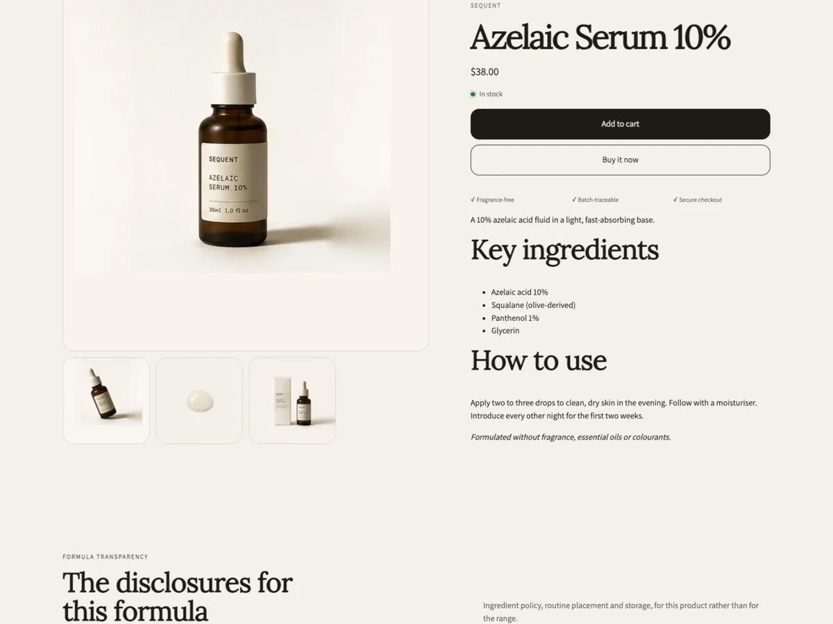
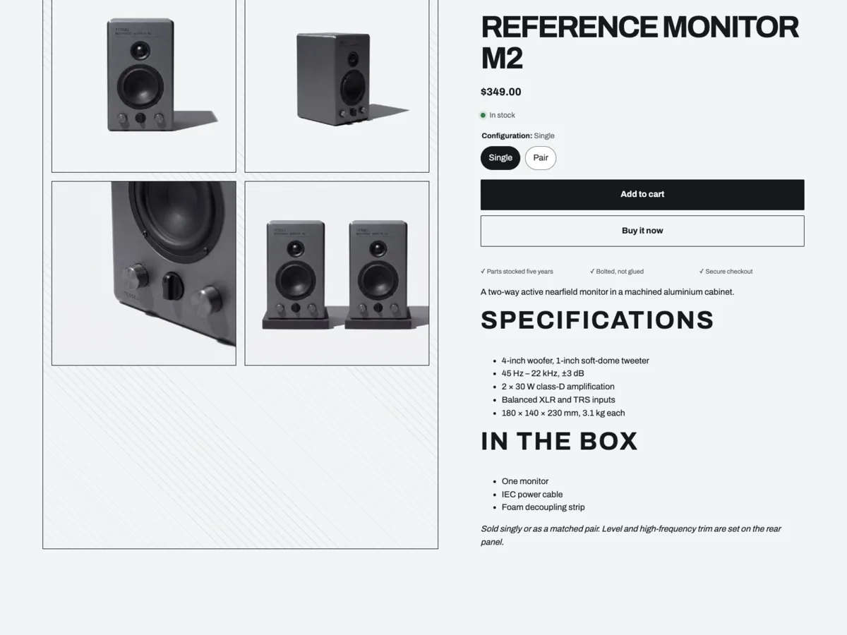
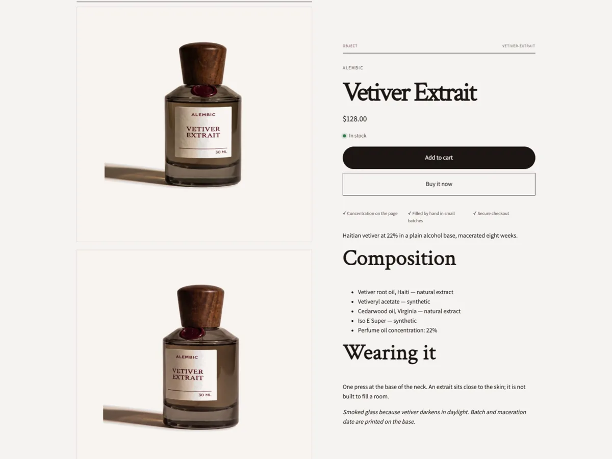
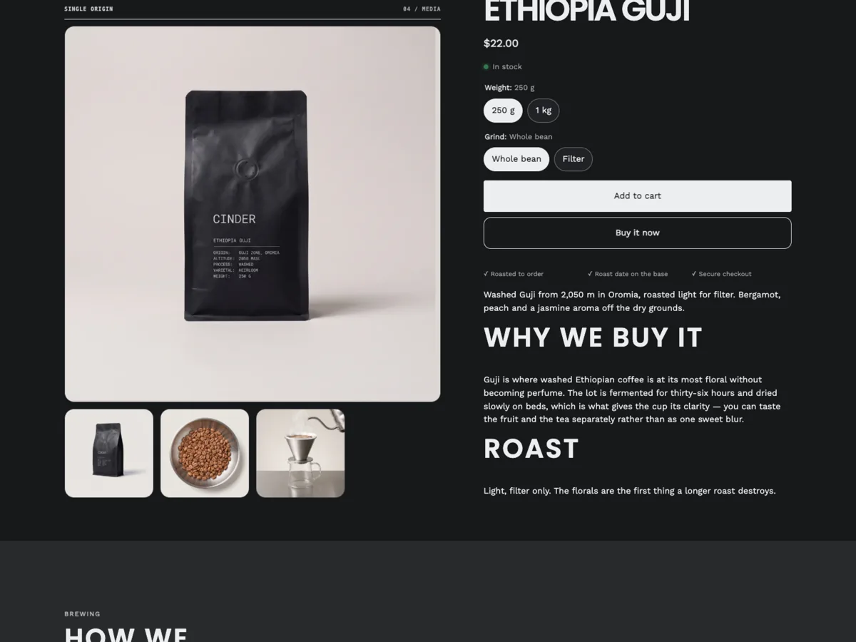
Six product templates ship with the theme. They differ in media treatment and in the sections they start with. Assign one per product in Products → Theme template, then add the sections your catalogue needs.El tema incluye seis plantillas de producto. Se diferencian en el tratamiento de las imágenes y en las secciones iniciales. Asigna una por producto en Productos → Plantilla del tema y añade las secciones que necesite tu catálogo.

Azelaic Serum product page: stacked media on the left, name, price and add to cart on the right, followed by key ingredients and how to use
Formula rows: active, concentration, routineFilas de fórmula: activo, concentración, rutina
Reference Monitor M2 product page: measured specifications set as labelled rows beside the media, with the condition each figure was measured under
Specification rows with measurement conditionsFilas de especificación con condiciones de medida
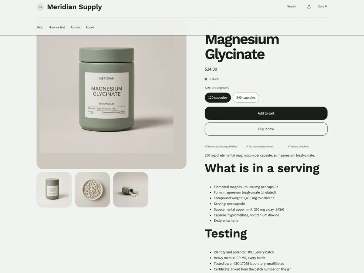
Magnesium Glycinate product page: dose, format and composition as labelled rows beside the media, with the certificate of analysis referenced
Evidence block: claim, method and source togetherBloque de evidencia: afirmación, método y fuente juntos

Variant selectorsSelectores de variante

Options render as swatches or as buttons, built from your product options. Unavailable combinations are marked, and selling plans appear in the buy block when a product has them.Las opciones se muestran como muestras de color o como botones, generadas a partir de las opciones del producto. Las combinaciones no disponibles se señalan y los planes de venta aparecen en el bloque de compra cuando existen.

Cart and cart drawerCarrito y panel de carrito

Adding to the cart opens a drawer; /cart remains a full page for shoppers who prefer it. Quantities can be changed and lines removed in either. A cross-sell block can be added to the cart page.Al añadir al carrito se abre un panel lateral; /cart sigue siendo una página completa para quien la prefiera. En ambas se pueden cambiar cantidades y eliminar líneas. La página de carrito admite un bloque de venta cruzada.

RecommendationsRecomendaciones

The recommendations section uses Shopify product recommendations and needs no configuration beyond how many products to show and the intent — related or complementary. Complementary products are set in Search & Discovery.La sección de recomendaciones usa las recomendaciones de Shopify y solo requiere indicar cuántos productos mostrar y la intención — relacionados o complementarios. Los complementarios se definen en Search & Discovery.

Recently viewedVistos recientemente

A rail of products the shopper has already opened, stored in their own browser. It renders nothing until there is something to show and can be cleared by the shopper.Una fila con los productos que el visitante ya ha abierto, guardada en su propio navegador. No se muestra hasta que hay algo que enseñar y el visitante puede vaciarla.

Journal and blogJournal y blog

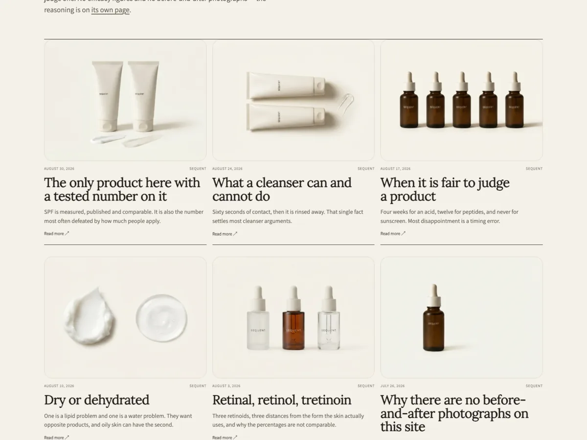
The blog index and article templates are built for editorial writing: covers, dates, standfirsts and a readable measure. Article covers come from the featured image — set one on every article, or the card shows the headline alone.Las plantillas de blog y artículo están pensadas para escritura editorial: portadas, fechas, entradillas y una medida legible. La portada procede de la imagen destacada — asigna una a cada artículo o la ficha mostrará solo el titular.

Sequent Skin Journal index: three article cards across with their own covers, dates, headlines and standfirsts
Journal index, VerityÍndice del Journal, Verity
Cinder Coffee Journal index: article cards on the dark ground with their own covers, dates and headlines
Journal index, BasaltÍndice del Journal, Basalt
Alembic Journal index: article cards with warm covers, dates and headlines in the house serif
Journal index, ClaretÍndice del Journal, Claret

PagesPáginas

Page templates include a default page, a contact page with a form, and an FAQ page. Any section can be added to any page in the theme editor.Las plantillas incluyen una página estándar, una de contacto con formulario y una de preguntas frecuentes. Cualquier sección puede añadirse a cualquier página desde el editor.

Localization and language and country selectorsLocalización y selectores de idioma y país

Country and language selectors can be shown in the header and the footer. They appear once markets or languages are added in your Shopify admin. All theme text is translated through the locales files and can be edited in Customize → Theme content.Los selectores de país e idioma pueden mostrarse en la cabecera y en el pie. Aparecen cuando añades mercados o idiomas en el panel de Shopify. Todo el texto del tema se traduce mediante los archivos de idioma y puede editarse en Personalizar → Contenido del tema.

AccessibilityAccesibilidad

Verity ships a skip-to-content link, visible keyboard focus on every control, semantic headings and landmarks, alt text passed through from your images, and reduced-motion support. Colour schemes were checked for text contrast; if you change colours, check small text against its background.Verity incluye un enlace para saltar al contenido, foco de teclado visible en cada control, encabezados y regiones semánticas, texto alternativo procedente de tus imágenes y respeto por la reducción de movimiento. Los esquemas de color se comprobaron para el contraste del texto; si cambias colores, revisa el texto pequeño sobre su fondo.

Responsive behaviourComportamiento adaptable

The theme is built and tested at 1440, 1363, 1200, 990, 768, 750 and 390 pixels. Navigation switches to a drawer below 750, the catalogue drops from four columns to two, and product media stacks.El tema está construido y probado a 1440, 1363, 1200, 990, 768, 750 y 390 píxeles. La navegación pasa a panel lateral por debajo de 750, el catálogo baja de cuatro columnas a dos y las imágenes de producto se apilan.

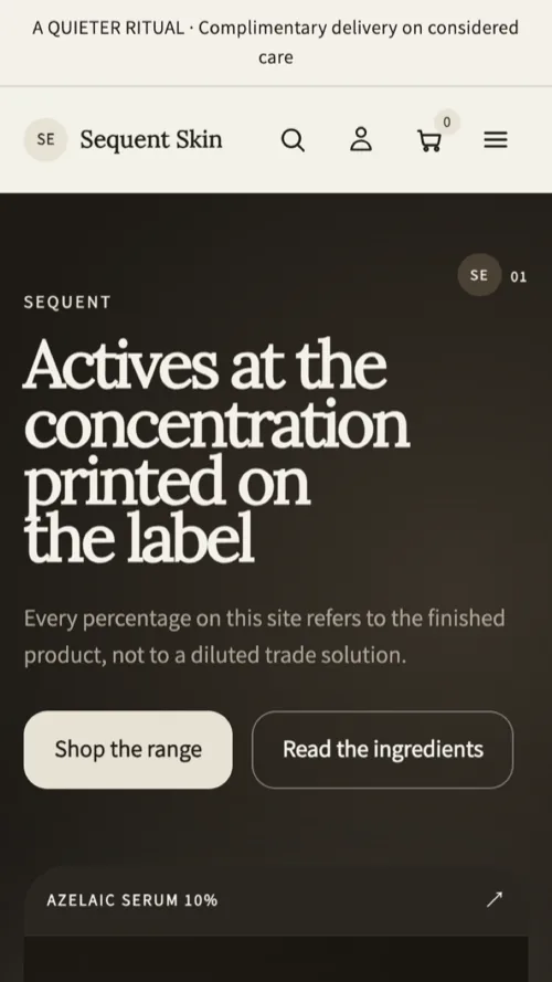
Sequent Skin home page on a phone: the editorial hero stacked above the product card, with the shop and ingredients buttons full width
390 pixels, Verity390 píxeles, Verity
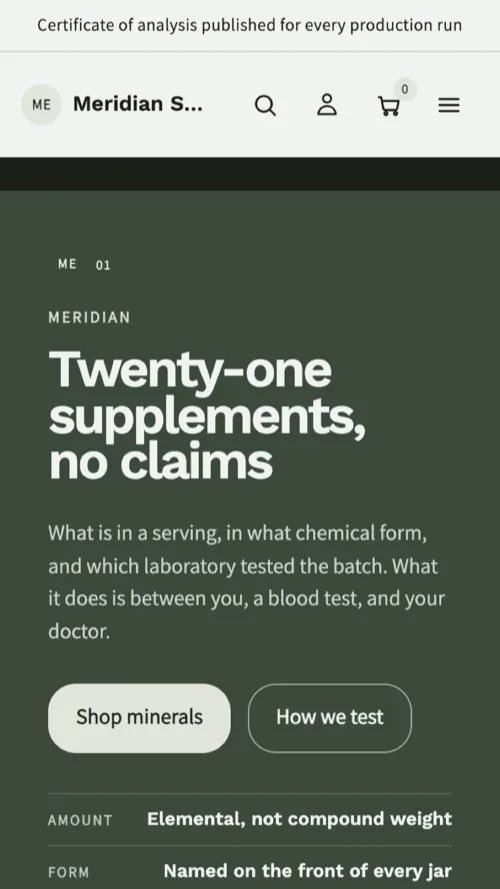
Meridian Supply home page on a phone: the pale hero stacked above the jar and the batch note
390 pixels, Sage390 píxeles, Sage
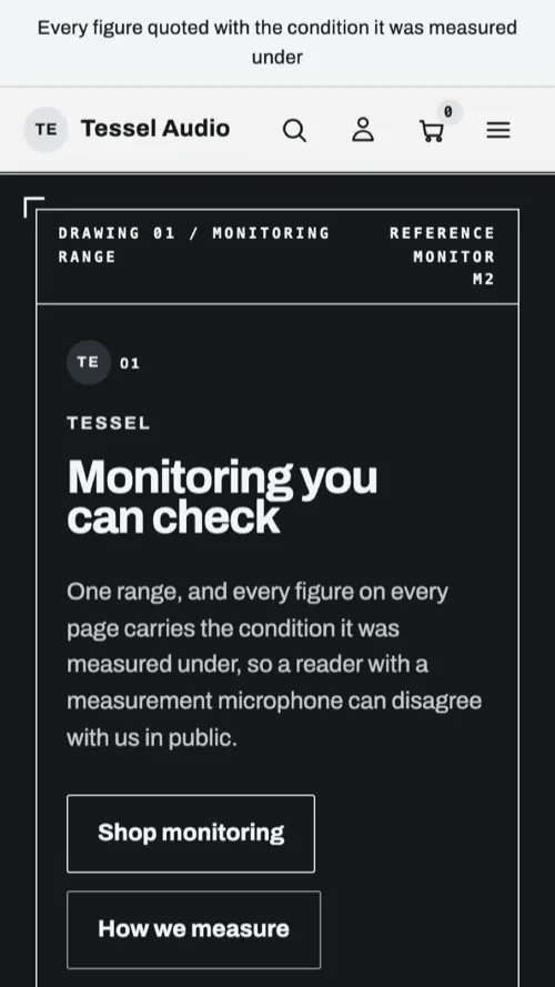
Tessel Audio home page on a phone: the drawing sheet frame stacked, headline
390 pixels, Graphite390 píxeles, Graphite

Image recommendationsRecomendaciones de imagen

WhereDóndeSizeTamañoNotesNotas
Product imagesImágenes de producto2000×2000 or larger2000×2000 o mayorSquare works in every preset; keep the subject centredEl cuadrado funciona en todos los presets; centra el objeto
Hero and full-widthHero y ancho completo2400×16002400×1600Leave room for text on the left thirdDeja espacio para el texto en el tercio izquierdo
Collection imageImagen de colección1600×9001600×900Used by the editorial collection layoutLa usa el diseño editorial de colección
Article coverPortada de artículo1600×12001600×1200One per articleUna por artículo
FaviconFavicon512×512512×512Square, legible at 16 pixelsCuadrado y legible a 16 píxeles

Upload the largest version you have; Shopify serves resized copies. Use JPEG for photographs and PNG where you need transparency.Sube la versión más grande que tengas; Shopify sirve copias redimensionadas. Usa JPEG para fotografías y PNG cuando necesites transparencia.

TroubleshootingResolución de problemas

Two controls appear on one product cardAparecen dos controles en una ficha

Quick view and quick add are both on. Leave one of them enabled in Theme settings → Product cards.Vista rápida y compra rápida están activas a la vez. Deja solo una en Configuración del tema → Fichas de producto.

A collection shows a row of four and then one card aloneUna colección muestra una fila de cuatro y luego una ficha sola

That row is centred by design. If the card is stretched instead, custom CSS is overriding the grid — remove it.Esa fila se centra por diseño. Si en cambio la ficha se estira, un CSS personalizado está anulando la retícula — elimínalo.

Article cards show no coverLas fichas de artículo no muestran portada

The article has no featured image. Add one in Content → Blog posts.El artículo no tiene imagen destacada. Añádela en Contenido → Entradas de blog.

Filters do not appearNo aparecen los filtros

Filtering is enabled in the section, but no filters are configured for your storefront. Add them in Search & Discovery.El filtrado está activado en la sección, pero no hay filtros configurados en tu tienda. Añádelos en Search & Discovery.

Text is hard to read after a colour changeEl texto cuesta de leer tras cambiar los colores

Check the text and background of that colour scheme. Small text needs a contrast ratio of at least 4.5:1.Revisa el texto y el fondo de ese esquema. El texto pequeño necesita un contraste mínimo de 4,5:1.

Updating the themeActualizar el tema

Shopify notifies you when a new version is available. Updates install as a new copy, so your published storefront never changes underneath you: install, re-apply custom settings, preview, then publish. Keep the previous version unpublished until you are satisfied.Shopify te avisa cuando hay una versión nueva. Las actualizaciones se instalan como una copia nueva, de modo que tu tienda publicada nunca cambia sin aviso: instala, vuelve a aplicar tus ajustes, previsualiza y publica. Mantén la versión anterior sin publicar hasta estar conforme.

Custom code added to theme files does not carry across an update. Keep a record of anything you edit.El código personalizado añadido a los archivos del tema no se conserva al actualizar. Guarda constancia de lo que modifiques.

Getting supportObtener soporte

Write to us through the Verity support form. Include your store URL, the theme version from Theme settings → Theme information, and a link to the page in question. We answer within two business days.Escríbenos mediante el formulario de soporte de Verity. Incluye la URL de tu tienda, la versión del tema que aparece en Configuración del tema → Información y un enlace a la página en cuestión. Respondemos en un plazo de dos días laborables.

Open the support formAbrir el formulario de soporte

Support scopeAlcance del soporte

We support the theme as delivered: installation, settings, sections, bugs and compatibility with Shopify features. We do not write custom code, build bespoke sections or debug third-party apps — though we will always tell you what is wrong when we can see it.Damos soporte al tema tal y como se entrega: instalación, ajustes, secciones, errores y compatibilidad con las funciones de Shopify. No escribimos código a medida, no construimos secciones personalizadas ni depuramos aplicaciones de terceros — aunque siempre te diremos qué falla cuando podamos verlo.

ChangelogRegistro de cambios

VersionVersiónDateFechaNotesNotas
1.0.01.0.0September 2026Septiembre de 2026First release. Five presets: Verity, Graphite, Claret, Basalt, Sage.Primera versión. Cinco presets: Verity, Graphite, Claret, Basalt y Sage.